


The Big Brother logo and Daniel Eatock
I wanted to share a very interesting interview from British graphic designer, Daniel Eatock, in which he talks about his involvement with one of Channel 4's greats, Big Brother. Eatock was commissioned in 2001 to design a logo for the show, which would attach an image for the audience. The designer took the concept in its most literal sense.
Big Brother is a entity that watches us, every aspect, every hour of the day, eternally. And what would be a more recognisable symbol of a watcher than an eye. Like the best ideas, it is blindingly obvious.
What I get from from looking at this logo and from reading the interview was that he wanted to create something that was going to stay stuck in your head, literally.
Below is an excerpt from the interview taken from his website.
"Unlike the Apple and Nike logo that were made before both brands were successful, when I was asked to make the Big Brother logo the show was already a proven success. I did my first Big Brother logo for series two. Even so I did not fully realize the success of series one, as I was living in the States. I approached the project with the aim of generating a logo that had a conceptual integrity and connection to the Orwellian idea of Big Brother. If Big Brother had flopped in the second series then the logo will not have been remembered. It’s only because of the success of the programme. It’s the same with the Nike swoosh or the Apple logo. If Apple went bust in the early 80s the logo would never be talked about".
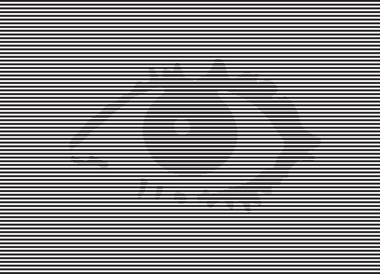
This logo is clearly going to stick in your head, it is visually blinding. I am completely in awe that this designer, who was in his 20's at the time was able to envisage designing a logo so powerful that you could hardly look at it. What an absolute GENIUS.
"On the television there was a certain point where the Big Brother logo didn’t need text any more. Just the symbol."
In fact the logo caused concern from The British Epilepsy Association who wrote to the designer and the media, alerting them that the logo had the potential to affect photo sensitive epilepsy sufferers and could provoke a seizure.
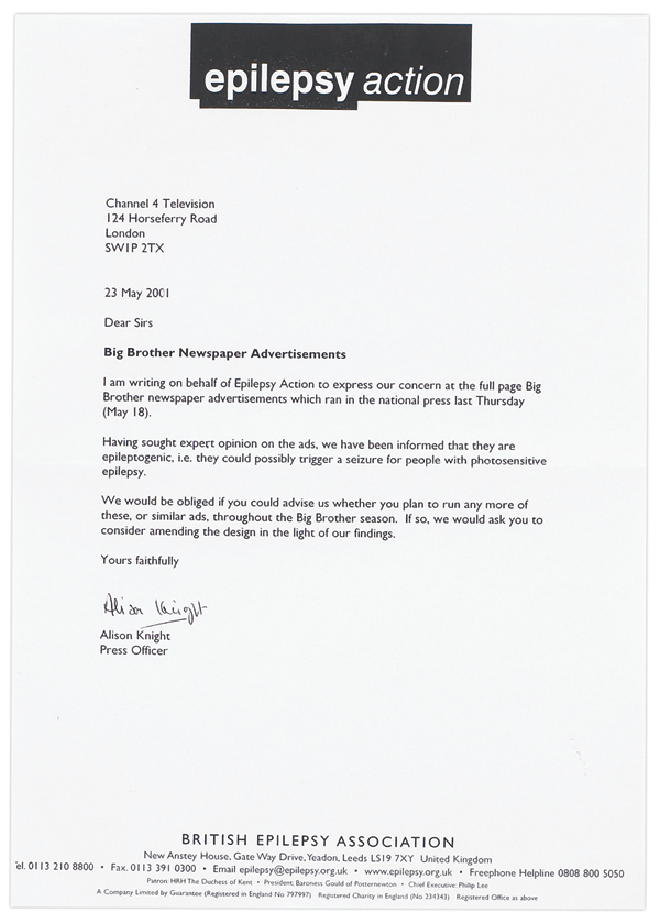
Upon requesting a change in the design of the logo, I think it's obvious the response the Association got..
Eatock was commissioned to design every series logo from then on until the final BB10.

I like the LOGO. Its an eye. A person who is controlling the people who lives in the house for several days and pretend that they are very happy and cool.......
Download Big Brother Online
Posted by: jason brees | 12 September 2011 at 11:41 AM